
Derived from Apple’s OS X, iOS kicked off the touch revolution six years ago. But while competitors like HTC, Samsung, LG, Google, Microsoft, and BlackBerry have constantly shown off newer and better looking versions of their own operating systems, Apple has largely refrained from tinkering with its success. Until now, that is. Due to mounting pressure from Android phones, Apple has redesigned iOS and added a host of new features. With iOS 7, Apple is trying to pull even with and one-up Android at every turn. So how does iOS 7 look when it is put side-by-side to Android? Below, we compare the lock screen, notification bar, and many other features to show you just how much iOS 7 does and doesn’t look like Google’s Android.
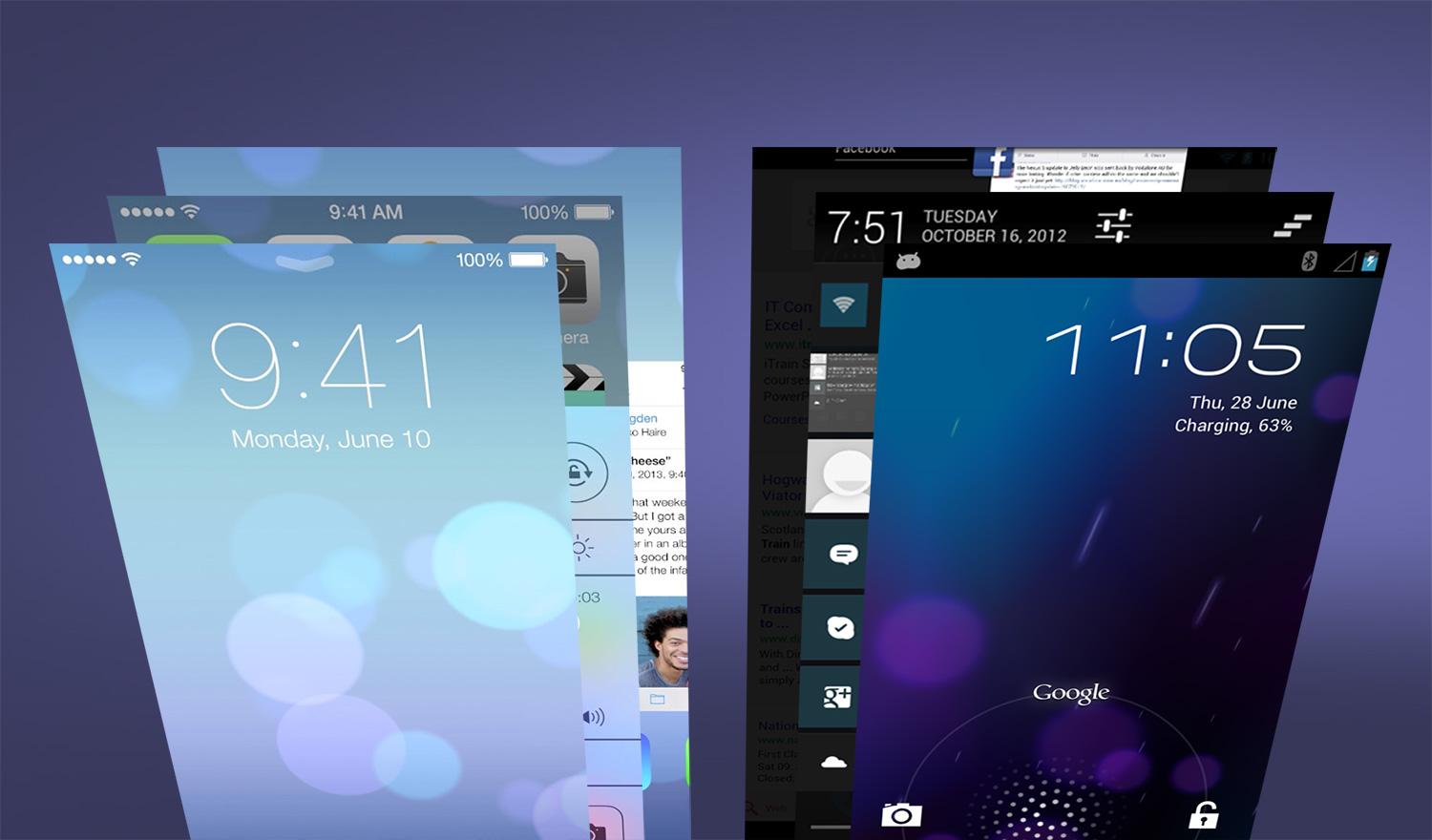
Lock Screen
Without diving in to the patent war between Samsung and Apple, the lock screen that Apple went through the trouble to defend in court was eliminated. This change is probably the best indication of what it has done to the entirety of iOS 7. Apple’s OS greets you with a new, clear, simple look that may or may not be a direct homage to Android’s own lock screen. All you’ll see is text telling you the time, date, and the directions to slide to unlock your device. In contrast, Android has a similar looking screen, but allows users to customize the information they get with widgets. Though widgets were rumored to make their way into iOS 7, they are still absent. So if you count on information presented in a translucent box to fill your lock screen, chalk this up as a win for Android 4.2 Jelly Bean.

Notifications
While we’re talking about the lock screen, it’s worth noting that iOS 7 offers the ability to view the notification bar without unlocking your device. This is a feature that has been present in Android for a few versions now. Previously, iOS users could view recent notifications, but not the whole list. There are differences in the design of iOS’s notifications, though. The Notification Center in iOS presents all information in a tabbed menu, allowing users to browse their notifications under Today, All, or Missed. Android simply presents these in a listed fashion in the order they are received and can then be dealt with as needed. The preference here will come down to how you like your notifications organized, how many yo get on a daily basis, and how you prefer to handle them. If you like to take care of things immediately, Android’s system is probably best for you as you can take action or dismiss them with some easy swipes. Apple’s redone notification system, on the other hand, will be nice for those who compartmentalize and don’t immediately act on notifications.

Navigation
Apple is probably best known for it’s single button approach to things, a design commitment that has long confused Windows fans when they use an Apple mouse with only one button on it.The iPhone and iPad only have one single button for navigation and the rest is done on screen. To streamline the process, Apple apps now feature slide-out “drawers” to enhance in-app navigation. These drawers have been
 One of the great things about
